Friday 23 September 2011

My Artist Statement is Percolating


A first attempt...

I have to make an "Artist Statement". I have no choice. The time is coming when I will be asked to produce one for the art show in January. I'm in big trouble!

If I think this is a problem, wait till I go through "opening night" of the art show. I will be sweating bullets. I am beginning to feel something like a virgin on wedding night! Why?  Because I don't know who I am as a artist in this new-to-me "art world" that I have become a part of. I have no historical context, practically no artistic history....I'm just a little little pea in this huge ocean of the artistic world...I think I need a life jacket...

But, it is a good thing to know that I am having fun in the "making" of my art. I  am learning and I am pushing myself to express what I feel. I am learning what that process for me is all about. I feel like I'm learning to drive and the gears are grinding quite a bit. I hope simply to be as authentic as a can, within the boundaries (where-ever those are) in this crazy art world.

I do not even know what my "voice" is. I read of a potter who spent over  a year, after his education, in a little shack alone by the lake to work out his "voice" in the expression of his art. He is now a successful artist making a living doing what he loves. Now I do know that this is rare, making a living at pottery!

Here is a definition of an "Art Statement" I found on the Internet.

Definition by Artist and writer Katherine Tyrrell (Feb. 18, '09)
"An artist's statement provides an insight into the artist's work and how it came about. In short, an artist's statement is a brief summary of what an artist would say if they could explain their own work in person. It focuses on the present while providing as much information from the past as is relevant. The best artist's statement is authentic and is written in the artist's own voice, although not always by the artist, and in language which is always simple and accessible."

Now that is both reassuring and scary.

I will be gone to a retreat this weekend and maybe I will come up with some ideas!

"Don't let anyone look down on you because you are young (or old!)....Show the believers how to be pure." 1 Tim. 4:12

Tuesday 20 September 2011

Some Experimentation Going On!

"In the beginning...."

A general guide to make sure the hand is proportionately correct.

One days progress on my next project.
Photos: Cliff Derksen

It was a full day at the studio yesterday.

First of all, I am bisking three pieces, a stand alone DNA piece, "Dancing David" and the "4.5 Weeks" hands piece. I loaded them the day before. Yesterday I arrived at 9am and turned the kiln, the exhaust fan and the room fan all on. I cannot wait to get to the studio today to see the results.

Cross your fingers with me...nothing blown up ok!

Secondly, other than a few "business errands" I spent most of the day in the studio. I needed to change the kiln settings as the day went on. By 2:50PM I set everything to "high". Now it was just waiting out the time till it would shut off automatically. By supper time it had not yet turned off. I had a bite to eat and when I returned at 6:50PM it was off. Now I had to wait till tomorrow, which is today...ugh.

So, thirdly, I began another project as you can see above.

But, I am doing things a little differently. Some experimentation  is going on. For me to move on to larger sizes I am testing two things. Firstly, I am using what is called "paper clay". This is clay specially made for sculpting and has shredded paper embedded in the clay. This does two things, it makes the clay hold it's form better as one sculpts and secondly as it is fired it burns up the paper in the clay and so the result is a lighter sculpture.

I do notice that with this clay the surface is rougher, so I will probably have to do some sanding both before it goes to bisk and also after bisking.

The second part of the experiment is I am forming the sculpture out of solid clay throughout. I am not making it hollow as I normally have done up to now. I will finish molding the hand, then when it is dry on the surface...I will use the special, unique "dent" test. If when I apply pressure with a finger and there is no dent, I know it is ready. At that point I will decide where I cut it apart, make my "line up" marks and do the cutting. Then I will take each piece and hollow out (remove) the inside clay till it has a 1 quarter inch shell. Then I use slurry and weld it all back together the way it was in the first place. I have to make sure one cannot see the joints. This is a technique one uses with larger pieces.

Now, if you will excuse me, I am off to open the kiln.

"Each of you should put your own actions to the test. Then you can take pride in yourself. You won't be comparing yourself to somebody else."  Gal. 6:4


Monday 19 September 2011

A Bird in the Hand...

My wife (Wilma) with "Bird in hand..."

She's in seventh heaven!
(My wife I mean!)
Photos: by Cliff Derksen

This past Saturday I was on my way to the studio. My wife Wilma was coming with me in her car as we were going to stop at the English Gardens at the Assiniboine Park on the way. I needed to take new photos of flowers for her daily blog and we were just going to spend time together walking, enjoying the ambiance, talking and just enjoying another beautiful fall day.

Just a few feet into the garden she observed a gentleman who had birds eating out of his hand. I didn't pay to much attention as I was concentrating of flowers when she came to me with a hand full of seeds declaring she was going to have birds eating out of her hand!

I set my camera to multiple shoots and somewhat sceptically waited with her as she stood holding out her hand waiting. After some light hearted bantering on my part such as, "you are looking like a bird feeder..." etc. suddenly a bird  magically appeared on her hand, picked up a seed and fled.

We were both in shock. But Wilma was transported. I only learned later the whole story of her feelings about birds, bird feeders, having wild birds eat our of your had etc.

It is a long history in her family. Her father loved birds and actually build a bird feeder out of automotive parts and such. We have that very one standing in our garden in our backyard. It is made out of a vehicle axel part, a disker disk to catch husks and seeds, above that a smaller dish for the seeds with a hole in it for rainwater to run out, and next above that is an upside down metal dish to act as an umbrella to keep the rain out of the smaller seed dish just below it. An amazing item in our garden.

Her father had it outside a window by his favorite chair. A bird book on the side table. It was not only a science, but a spiritual experience with her father. 

I kept moving along photographing with Wilma following with her hand stretched out. Everywhere we went, birds kept partaking of the seeds in her hand. It was a spiritual experience. She wished he was wearing a white robe, reminding her of Frances of Assisi and his experiences with his feathered friends.

Above are some of the photos I was able to snap during her amazing experience. 

Every bird in her hand was so special to her. Way more important than any in the bush during those moments. 

 "So God created ... every winged bird according to its kind. And God saw that it was good."  Gen. 1:21


FYI - Something interesting I found....

"A bird in the hand is better than two in the bush."

It's Meaning (From: Phrase Dictionary)

It's better to have a small real advantage than the possibility of a greater one.

Origin

bird in hand
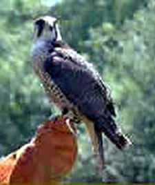
This proverb refers back to mediaeval falconry where a bird in the hand (the falcon) was a valuable asset and certainly worth more than two in the bush (the prey).
The first citation of the expression in print in its currently used form is found in John Ray's A Hand-book of Proverbs, 1670, which he lists it as:
A [also 'one'] bird in the hand is worth two in the bush
By how much the phrase predates Ray's publishing isn't clear, as variants of it were known for centuries before 1670. The earliest English version of the proverb is from the Bible and was translated into English in Wycliffe's version in 1382, although Latin texts have it from the 13th century:
Ecclesiastes IX - A living dog is better than a dead lion.
Alternatives that explicitly mention birds in hand come later. The earliest of those is in Hugh Rhodes' The Boke of Nurture or Schoole of Good Maners, circa 1530:
"A byrd in hand - is worth ten flye at large."
A bird in the hand is worth two in the bushJohn Heywood, the 16th century collector of proverbs, recorded another version in his ambitiously titled A dialogue conteinyng the nomber in effect of all the prouerbes in the Englishe tongue, 1546:
"Better one byrde in hande than ten in the wood."
The Bird in Hand was adopted as a pub name in England in the Middle Ages and many of these still survive.
The term bird in hand must have been known in the USA by 1734, as that is the date when a small town in Pennsylvania was founded with that name.

Announcing..."Foxy David" is Done!

Foxy David, 2011, 9" wide x 8"deep x 12.5" high, clay & antique gells.
Photos: Cliff Derksen


What a day at the studio, finishing "Foxy David"!

There he is full of manly vigor, glowing with passion, confidence brimming out everywhere, brash and saucy. I gave him a fox head because in this incident he was being "foxy". It is a many layered figure that has humor on one level and deep anguish and tragedy on another.

The sword is a symbol of his power and vigor. His is dressed in his expensive, casual, silky evening ware. It communicates a feeling of sensuality. The spy glass is used to invade privacy.

But as you can see, he's not sitting on a throne. At least not the right throne! No, he's wielding his power from another place! And it leads to nothing good. In fact it leads to adultery and more tragic consequences to follow. That is why he is sitting on a tombstone.

How is it that I came to make such a figure? I am not sure myself. He is my favorite character in the Bible. It was the first figure I made upon moving into my art studio last June. We had already had the preliminary hearing, and so we had just been learning many new things about what had happened to our daughter Candace. How the man eventually accused of second degree murder without parole for 25 years, stalked and ogled the girls in the store outside Candace's school. Evidence leads us to believe he probably stalked her as she walked home that evening. I have a feeling it had something to do with that. It was top of mind and came out in my creative work.

Despite it's kind of dark humorous side, the figure stands as a constant warning to be vigilant. It is an important story we should all know and remember.

"Blind Pharisee! First clean the inside of the cup and dish, and then the outside also will be clean."
Matt. 23:26


Saturday 17 September 2011

"A "Peek" at Foxy David's Character!"

He's on the worktable, the first coat
of copper is being applied.

The copper reveals my signature!

King David looking pretty regal.
He is ready for his next and final coat.

While I'm at my studio, here is what will happen to David.

He will get two colors. The technique is the same as with the Jonah sculpture. There I used silver as the base coat and then used black to highlight and give tone and texture. “Foxy David” has just had his first coat of metallic copper completed. He’s looking rich, royal, powerful, confident and I have to say even "saucy".

Saucy meaning...
1. Impudent; flippant  - a saucy remark
2. Bold and lively - smart looking
3. Sexually suggestive, typically in a way intended to be ligthhearted.
(Dictionary.com)

I will then apply a second walnut color. This will give the figure depth and tone. When I apply the walnut I can use paper towel to wipe it back to reveal the copper tone underneath. This means the deeper aspects of the clothing etc. will remain darker (walnut) and the higher areas will reveal the copper.

I don’t want it to be a “dark” figure so I will be applying  the walnut sparingly, wiping as necessary to keep some luminosity to the figure.

These tones compliment the sad event this figure depicts, David, the king, in a relaxed mood on his rooftop, ogling the neighbourhood, getting himself into serious trouble.

"But each one is tempted when, by his own evil desire, he is dragged away and enticed."
James 1:14


Thursday 15 September 2011

Ladies and Gentlemen, Jonah's Done!


A "man of steel" who is unaware that
he's going down!

Jonah, a Man of Steel, 2011, 18" long x 10" wide x 15.5" high, clay and antique gells
Photo's: Cliff Derksen

I was very happy as I left my studio today. I have finally, after a few attempts, been able to complete a sculpture that is very near my heart.

The subject of this sculpture was instrumental in making me who I am today. Jonah and his story became an uncomfortable yet very encouraging kick start to my personal spiritual renewal. Because of this I agonized over how he should not only be crafted, a "he-man" blindly driving a sinking boat. But what colors should I chose to compliment this mindset.

A mind-set that I began to understand was a reality for me and is a reality for a lot of men today.

Therefore it would be the color that would make him look "right" as a sculpture.

I chose finally to go metallic. This would correspond with his inner issues of going it his own way,  And, living life blind to reality, destroying himself and others as he lives with this masculine “straight jacket” that will eventually destroy him, despite his delusions of strength and power.

The iron or metal look I believe goes well with this idea and makes the presentation complete.

I for one, like it.

"An unfriendly man pursues selfish ends; he defies all sound judgment."
Prov. 18:1


Thursday 8 September 2011

Silver Applied

A metallic silver base color.

On my way to the studio I picked up more of the metallic colors I needed for Jonah, and immediately went to work giving him that first coat.

Above you see the results of "phase one" of the coloring process.
What do you think? Can you see how the "metallic" aspect communicates his character. Namely things like; unbending, cold, harsh, brash and so on. That will be more obvious when the next color is applied.

If you look closely at the water at the base of the boat, you will see a hint of blue (which I had applied earlier) showing through the silver! Love it.

Next, I will be applying the black gel over-top this silver. I know that sounds crazy but trust me, it will be amazing. (I hope!) Once applied I will take a damp cloth and rub the black away at areas of highlight or interest to bring out the silver beneath. I am so looking forward to see what that will look like! Yes, I'm just as curious as you are!

"Whereas you saw the feet and toes, partly of potter's clay and partly of iron, the kingdom shall be divided; yet the strength of the iron shall be in it, just as you saw the iron mixed with ceramic clay."  Dan. 2:41


Wednesday 7 September 2011

Smashing through the "Wall of Color"!

I did a very quick test run of the "color" on my sample Jonah.
Will the real Jonah please stand up.

I have not been going to my studio much because I've been kind of stalled. 

Let me explain. You see I have been not only working in my studio but also at my business. My business keeps interrupting my art! One of the biggest interruptions lately has been that I have injured myself! Yes, it is true. My true male masculine self doesn't like to admit it but I have to say I have been slightly "slowed down." I had to cover for one of my staff, and I had to clean 6 places in one weekend. At the very first place I lifted a very heavy mat to flip it over and forgetting it's weight was not prepared for the strain and sure enough, pulled some muscles in my upper back. Well, it did not hurt that bad at the time and so I continued working. That was Saturday. The next day in the afternoon I continued cleaning the four places left, and it became a marathon of pain.

I could have stopped but no...never considered it. Kept going and made what would have been a minor injury into a major, life effecting, muscle twitching painful experience. So, I have been recuperating now for a while..

But I have not stopped working on my art! I have been "thinking" (I know, hard to believe) ...about color.

You see I have been continuing to create new work, some are bisqued some are not. But both the dried work, the bisqued, and the green ware, are all on my shelves waiting to be finished. I had hit the wall. The wall of coloring my work. "I have to deal with it" I thought, "and it might as well be now while I'm too sore to spend much time in the studio."

So I have been thinking about what colors to use to finish my sculptures.

This is an issue for me and a lot of artists working with ceramics. We enjoy the creating part of the work but are loath to deal with the surface color issue. Do we use glaze? Maybe under-glazes? What colors work best with what I'm trying to say with each piece? Should there be texture to the surface? Should I use a wash? But again what color do I use and what should my pallet of colors be? Maybe I should go monochrome! OK, but again then, what color of monochrome should I use? What is my "voice in surface and color"?

All through the joy of creating my pieces I have had this one sobering thought....what color will I make this piece? And since I could not come up with a definitive answer, I put it off.

BUT NO LONGER!

I had begun to color Jonah, but I just was not satisfied with it. It did not really reflect the essence of the character of the prophet. It might have looked nice but nice is not the answer here. I needed his essence oozing out of the color of the work.

I have memorized Jonah, and have come to understand him as a grumpy stubborn man who is not happy to obey God's orders to deliver a message to the Ninevites. After all, these were the bitter enemies of his country and the people of Israel. They raided their towns and villages, venting their rage in cruel and unspeakable ways. They were hated by Israel and by Jonah. None of Jonah's friends would understand him going to preach to these barbarians. What if they repent and God forgives them? Horrors! No one, not even Jonah wants that to happen. As far as he's concerned these people don't deserve even the chance to repent, and he's afraid to preach because he knows that God is long-suffereing and forgives those who repent, and he doesn't want that to happen to these pagan, beastly, idol worshiping, war mongering enemies of Israel.

So, I gave him a Rottweiler head. A stubborn, tough, prone to disobey breed of hounds. Secondly the color should reflect his attitude of "I want to do things my way" life style.

With all of this in mind, I stood before what seemed to me millions of color choices and glaze options at "Sounding Stone". Finally, after a few visits I remembered a figure I'd done over 5 years ago.  "I am the Gate". I'd painted him with two different colors of gel, then wiped the second coat off at points I wished to highlight to reveal the undercoat of color. It turned out great. The light went on.

I asked for the "antique gel" section and found some colors to match the character of Jonah. I chose metallic colors, silver and black. This was Jonah, the hard surface of metal said it all, unforgiving, cold, unfeeling, harsh. Something that could be imagined bashing it's way through life. That's it! (fist pump) I got it!

Not only that, but I believed this technique would work for the rest of my stuff. With different colors of course. Unbelievable, I had my color and "surface voice" for my pieces.

OK, Now I feel a lot wait off my shoulders and, my back feels a lot better too.

" Then they sent the tunic of many colors, and they brought it to their father and said, "We have found this. Do you know whether it is your son's tunic or not?"   
Gen. 37:32